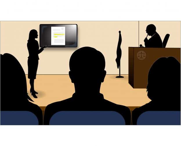
Have you ever wondered whether the advice you give to clients is always as sound in practice as it is in theory? Recently I was selected to serve as a juror on a 3-week medical malpractice trial. I had always wanted to serve on a jury. I felt it would be a golden opportunity to see what the visual presentation of a case looks like from the perspective of a juror – as opposed to the creator. Somewhat like a doctor who suffers injury or illness might experience treatment from the point of view of a patient, instead of their usual mindset as a medical professional.
Both the plaintiff’s attorney and defense attorney were experienced trial lawyers with excellent oratory and tactical skills. Their visual presentations could have been significantly improved, however, by adhering to the basic principles we preach as visual presentation experts. These include:
LESS IS MORE
Both lawyers packed too much information into each slide. On their timelines and document slides, the text was too small, so the jury couldn’t read it. In addition to rendering these visuals useless, a number of my fellow jurors expressed irritation with the lawyers. Some wondered if they might be trying to hide something. In general, we felt burdened by information overload. Strive to include on a slide the minimum amount of information needed to convey the intended point.
CHOOSE YOUR MEDIA WISELY
One of the attorneys used a PowerPoint slide deck for all of his visuals. When experts were on the stand, he would cycle back and forth until he landed on the desired slide, sometimes taking a minute or two. While PowerPoint is sequential and appropriate for a step-by-step opening or closing, it is not nimble enough for direct or cross-examination. TrialDirector software is the way to go (if your budget allows, hire a courtroom technician to run it for you). Neither attorney used poster-boards. Key graphics should be printed on them and left displayed on an easel while the PowerPoint is also displayed. The combination can be an effective way to mix media and keep jurors’ attention.
WELL-DESIGNED GRAPHICS BEST TELL YOUR STORY
During the trial, we were inundated with documents, with just a few images from anatomy books sprinkled in between. A handful of well-conceived, understandable graphics using icons or illustrations would have been considerably more impactful and persuasive than what we saw. Neither attorney was effectively able to focus and communicate his case themes. Both sides would have benefitted from using use text callout graphics – aka “text pulls” – where the key language is enlarged, instead of highlighted document pages, whenever possible.
USE HIGHLIGHTING JUDICIOUSLY
On a typical document page shown by the plaintiff’s attorney, he had highlighted in yellow numerous lines. On top of that, he had underlined in red some of that already highlighted text, presumably to add additional emphasis. The result was that we didn’t know where to direct our attention. Ask yourself what the key point of an excerpt is and highlight only the text that is truly necessary to make the point. Consider using red bold text instead of yellow highlighting. Avoid using both at the same time.
COLOR CHOICE IS IMPORTANT
The plaintiff’s attorney used a style template with a black and red background. While black can be associated with power and strength, more often than not it carries a negative connotation (fear, death, the unknown). Similarly, while red may be used to attract attention, it is often associated with bad, evil, or danger. A better choice might have been the use of blue tones, which project trust, strength, and confidence. Color subconsciously influences our thinking and is a subtle yet powerful thing. Either rely on a professional designer for appropriate color choices or familiarize yourself with basic color psychology.
DON’T FORGET ABOUT CLOSING
One of the lawyers used no demonstratives during his lengthy closing, and the other had a standard bullet point PowerPoint presentation. As good as their arguments may have been, it was difficult to focus without having visuals. Closing arguments are the perfect time to illustrate analogies, use comparison charts, summary graphics, etc. In your last opportunity to sell your case to the jury, why not place it in an attractive package that jurors will want to buy?
Seeing visuals through the eyes of a juror was a valuable opportunity. As expected, I learned that the core principles that guide trial graphics experts are as true in practice as they are in theory.

